

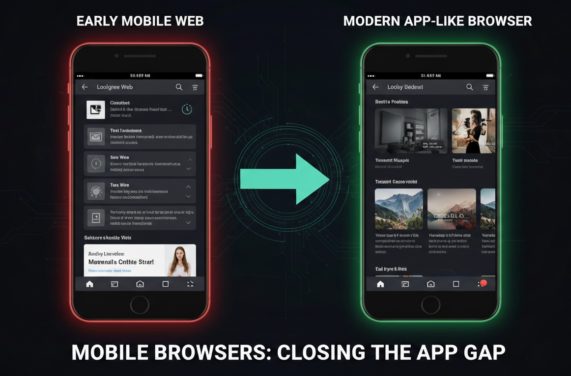
For a long time, mobile users followed an unspoken rule. If you wanted something to feel smooth and reliable, you used an app. Browsers were fine for quick searches or opening links, but anything interactive often felt like a compromise. Slow loading, awkward resizing, and sudden reloads were simply part of using the web on a phone.
That expectation is starting to change.
Over the past few years or so, mobile browsers have quietly improved in ways that are easy to feel but hard to describe. Experiences that once felt clumsy now feel comfortable. Not identical to apps, but close enough that the old gap between apps and browsers no longer feels as obvious as it used to be.
What people really mean when they say “app-like”
When people describe something as “app-like,” they are usually not talking about visuals. The difference is in the experience and behaviour.
An app-like experience loads quickly without making you wonder if something went wrong. It responds immediately to taps and swipes. If you leave for a moment and return, it continues where you left off instead of starting over. When the phone rotates, the layout adapts smoothly rather than breaking or resetting.
Just as important, the browser itself fades into the background. There are fewer flashes, fewer interruptions, and fewer moments that pull you out of the experience. When those small points of friction disappear, the experience feels easier to trust.
Why this matters in everyday mobile use
Most mobile users use mobile short bursts. A few minutes while waiting, a quick break between tasks, or a moment to unwind. In those moments, patience is limited.
At the same time, many people are becoming more selective about what they install. Phones fill up quickly, and not every activity justifies a permanent app. When something is used occasionally, downloading and managing another app can feel like unnecessary effort.
This is where improved mobile browser experiences start to matter. When something opens instantly and works well in the browser, the barrier disappears. The decision becomes simple. Does this work right now, when I want it?
Games show how far mobile browsers have come
Interactive content tends to expose weaknesses quickly, and games are a clear example. They need responsive controls, stable performance, and the ability to pause and resume without frustration. For a long time, this made native apps the obvious choice.
That balance has started to shift.
A familiar example is Slope. For years, it was known as a fast-paced game best played on a desktop browser with a keyboard. On mobile, experiences like this were either unavailable or too awkward to enjoy.
Today, advances in mobile browser performance and input handling mean games like Slope can run smoothly in mobile browsers as well. Touch controls respond accurately, sessions hold together, and the experience no longer feels like a reduced version of the desktop game. For users, it simply works in moments where it previously did not.
A quiet shift in how mobile games load
Some web-first platforms have actively adapted to these changes. Browser-based gaming platforms like Y8 have focused on reworking how mobile games load and resume, not by adding visible features, but by removing friction.
Instead of treating mobile browsers as a weaker environment, the approach has been to design around their strengths. Faster initialization, fewer reloads, and better session handling make it possible to open a game, play briefly, leave, and return without starting over.
Y8 has outlined this approach in a technical write-up explaining how mobile game loading was rethought to reduce interruption and improve continuity on phones, which can be read here: We changed how mobile games load on Y8
This kind of behind-the-scenes work is rarely visible to users, but it directly affects how browser-based experiences feel on mobile.
What this unlocks for users
As browser experiences become smoother, the importance of installation fades. Users care less about whether something is an app or a website and more about how easily it fits into their time.
This encourages experimentation. People are more willing to try something when there is no commitment attached. If it works, they return. If it does not, they move on without friction.
For short, repeat interactions, the mobile browser becomes a comfortable place to spend time rather than a last resort.
Browsers are earning their place alongside apps
Apps are not going away. They remain the best choice for experiences that require deep engagement or frequent use. What has changed is that browsers are no longer automatically the weaker option.
Modern mobile browsers are increasingly capable of delivering interactive experiences that feel stable and responsive. In markets where storage space or connectivity is limited, this matters even more. In others, it simply makes everyday mobile use feel lighter and less cluttered.
As these improvements continue, users may stop thinking in terms of apps versus browsers altogether. Instead, they will choose whatever works best in the moment, and more often than before, the mobile browser will be a perfectly good answer.